


The Visual Symphony
of Synapse
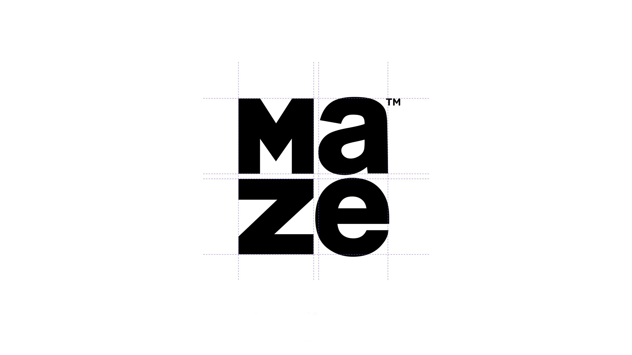
A bold and modern typographic composition that reflects a strong brand identity. This stacked layout, paired with the heavy sans-serif typeface in all-caps, conveys strength, clarity, and structure.
The period at the end of “respect.” adds a sense of finality and confidence. The contrast between the compact, blocky “Maze” and the open, conversational style of “local respect.” creates a visual balance and communicates dual brand values: authority and approachability.
The monochrome black-and-white palette ensures high contrast and timelessness, reinforcing a clean and professional visual language. As a branding piece, this logo effectively communicates community-centric values with a modern urban edge.

Content Campaign

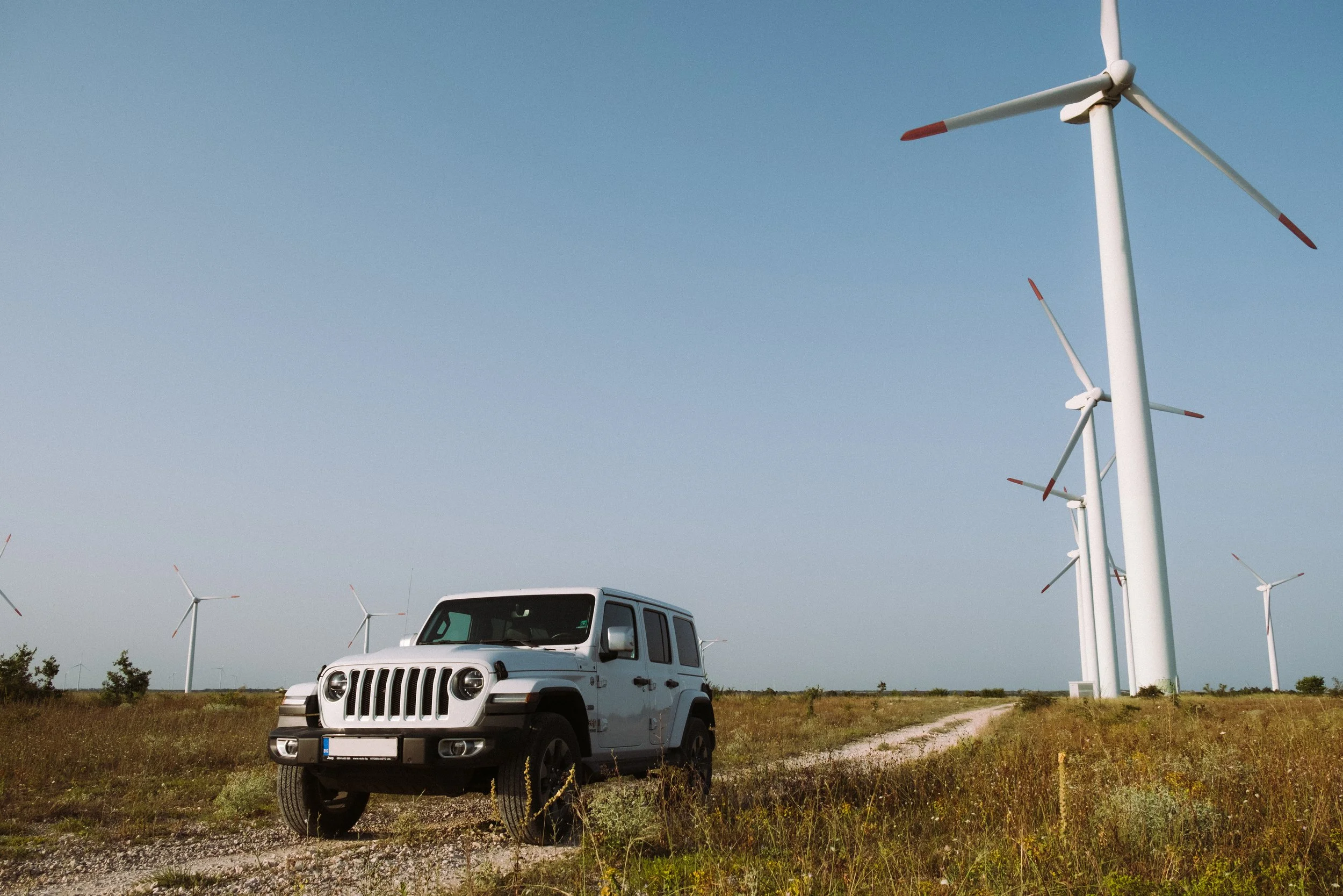
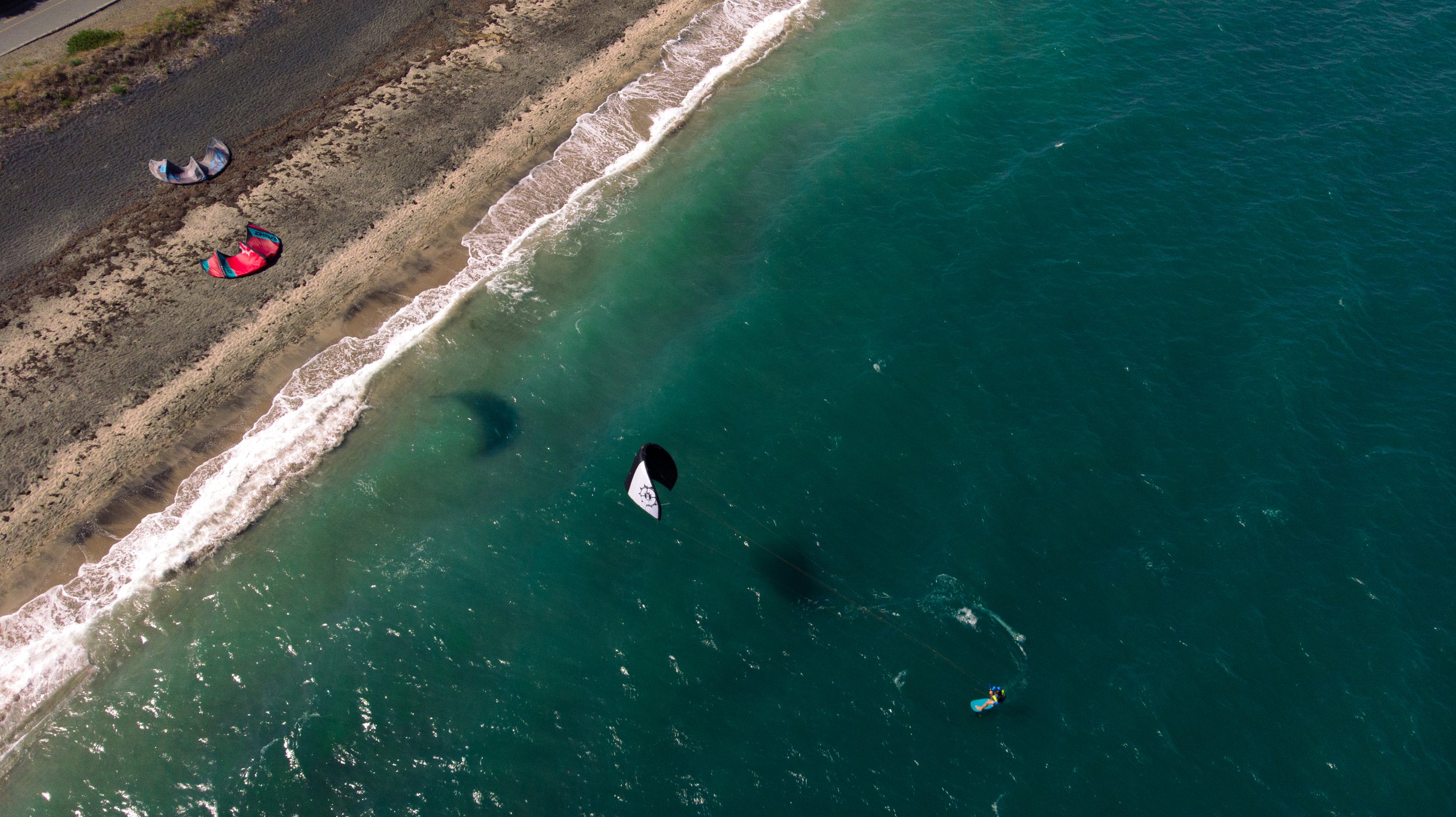
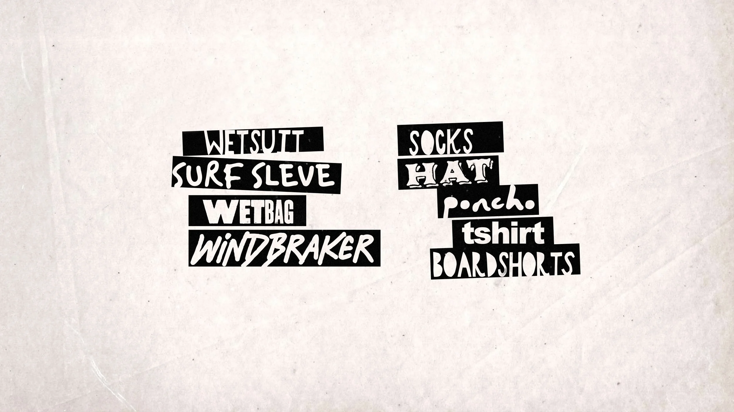
Following the brand identity of Maze we embedded it into a campaign with some local athletes showcasing the support for sports like Kite Surfing, Wind Surfing, Skateboarding and more. The campaign was supported by Vitosha Auto with the Jeep Wrangler.
The objective here was to capture still and motion images that align with the brand guidelines.